PROMPT RECORD · 公开作品详情
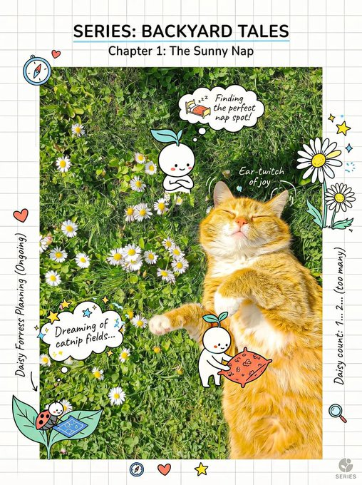
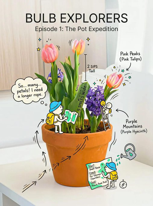
创作一个明快、富有创意的构图,将写实的主体与俏皮的手绘涂鸦以及一个微妙的微型故事融合在一起。
公开 AI 图像创作记录,包含原图、提示词、使用模型、作者、标签与来源。
- 使用模型
- GPT-Image-2
- 创作者
- @Nas_tech_AI
- 发布时间
- Mon Jun 29 14:07:56 +0000 2026
- 图片数量
- 2 张
完整提示词
源提示词按原始换行与标点完整保留Create a cheerful, creative composition that blends a realistic subject with playful hand-drawn doodles and a subtle micro-story. Subject: [insert object / person / product — keep simple and recognizable] Layout: - Invisible clean grid system underneath - Balanced, airy spacing (avoid clutter) - Clear hierarchy: subject first, doodles second, micro details third Doodles (IMPORTANT): - Playful, expressive, slightly exaggerated - Include: smiley faces, stars, sparkles, arrows, motion lines, cute icons - Doodles must INTERACT with the subject (touching, pulling, lifting, reacting) Micro Story: - Add a tiny, fun narrative (e.g., doodle characters using the object, reacting to it) - Keep it subtle and discoverable on second glance Typography: - Friendly sans-serif + handwritten notes - Casual tone (not serious, not corporate) - Include small fun labels or thoughts Color: - Base: white / soft cream - Ink: soft black / dark grey - Accents: 2–3 cheerful colors (yellow, sky blue, soft red, mint, etc.) Lighting: - Bright, soft, uplifting - No harsh shadows Style: - Clean + playful + slightly imperfect - Feels human, warm, and creative Constraints: - Do NOT overcrowd - Every doodle must have purpose or interaction - Keep subject clearly visible (no obstruction) - Maintain breathing space Mood: [cheerful / curious / lighthearted / imaginative]Add a consistent visual signature: - same doodle style across all designs - same color accent system - recurring tiny character Introduce a “main doodle character” that appears in every composition interacting with different subjects. Keep composition consistent across series: - same framing - same spacing logic - same typography style Goal: Make the design instantly recognizable as part of a series.
提示词译文
译文与源提示词分开显示,不替代原文创作一个明快、富有创意的构图,将写实的主体与俏皮的手绘涂鸦以及一个微妙的微型故事融合在一起。 主体: [插入对象 / 人物 / 产品 — 保持简洁且易于辨识] 布局: - 底层有一个不可见的清晰网格系统 - 均衡、留白充足的间距(避免杂乱) - 清晰的层级:主体优先,涂鸦其次,细节第三 涂鸦(重要): - 俏皮、富有表现力、略微夸张 - 包括:笑脸、星星、闪光、箭头、运动线条、可爱图标 - 涂鸦必须与主体互动(触碰、拉扯、托起、反应) 微型故事: - 加入一个微小、有趣的叙事(例如,涂鸦角色使用该物体、对它做出反应) - 保持微妙,第二眼才能发现 字体: - 友好的无衬线字体 + 手写注释 - 休闲语气(不严肃、不企业化) - 包含小巧有趣的标签或想法 颜色: - 底色:白色 / 柔和的米色 - 墨色:柔和的黑色 / 深灰色 - 强调色:2–3 种明快的颜色(黄色、天蓝色、柔和的红色、薄荷绿等) 光线: - 明亮、柔和、令人愉悦 - 没有刺眼的阴影 风格: - 干净 + 俏皮 + 略带不完美 - 感觉人性化、温暖且富有创意 约束: - 不要过于拥挤 - 每个涂鸦都必须有目的或互动 - 保持主体清晰可见(不要遮挡) - 保持呼吸空间 氛围: [明快 / 好奇 / 轻松 / 富有想象力]添加一致的视觉标识: - 所有设计使用相同的涂鸦风格 - 相同的强调色系统 - 重复出现的小角色 引入一个“主要涂鸦角色”,它出现在每一幅作品中,与不同的主体互动。 保持系列构图的一致性: - 相同的取景 - 相同的间距逻辑 - 相同的字体风格 目标: 使设计一眼就能被识别为系列的一部分。