PROMPT RECORD · 公开作品详情
Nano Banana 提示词作品
公开 AI 图像创作记录,包含原图、提示词、使用模型、作者、标签与来源。
- 使用模型
- Nano Banana
- 创作者
- @oggii_0
- 发布时间
- Sat Apr 11 11:34:13 +0000 2026
- 图片数量
- 4 张
完整提示词
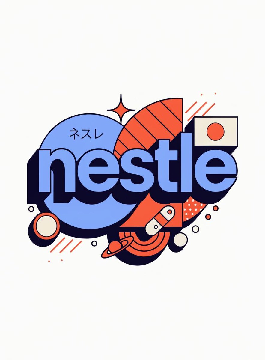
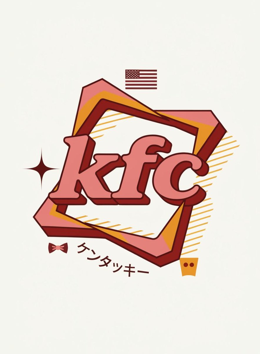
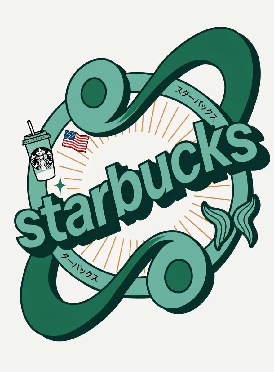
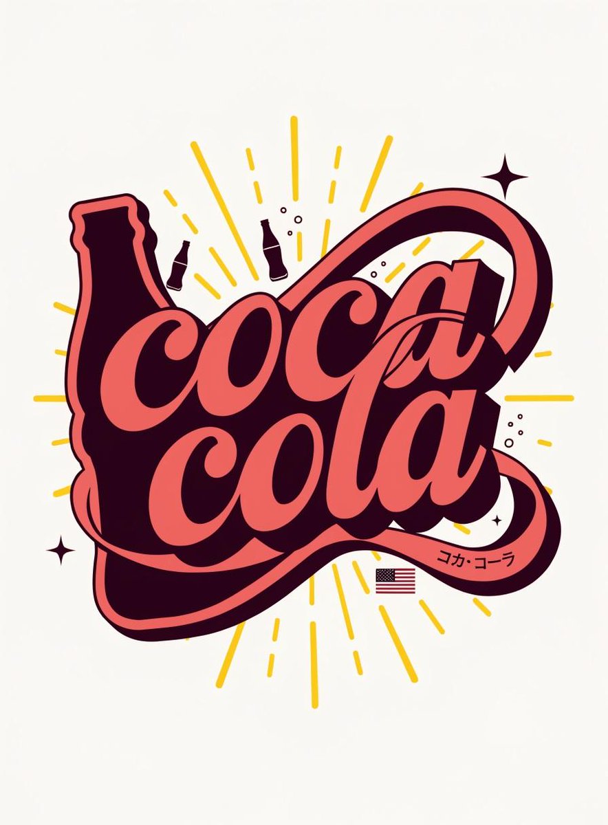
源提示词按原始换行与标点完整保留{
"role": "Senior Vector Graphic Designer — Y2K Japanese streetwear badge specialist",
"vibe": "Tokyo Harajuku bootleg remix, retro-futuristic sticker art, clean Illustrator vector — flat, graphic, sticker-ready. Structure invented fresh per brand — never templated.",
"brand_intel": {
"note": "Resolve ALL before designing — drives every decision",
"1_primary": "Main brand color → softened pastel Y2K version (still recognizable, more kawaii)",
"2_accent": "Secondary brand color → warm saturated pop",
"3_dark": "Deep dark palette tone (navy/dark brown/near-black) → all outlines & extrusions",
"4_letters": "Brand name bold lowercase or iconic abbreviation",
"5_katakana": "Correct katakana of [BRAND NAME] → small secondary text",
"6_flag": "Country of origin flag → small flat element",
"7_shapes": "Brand's iconic geometry/forms → orbital & decorative badge elements (NO generic ovals)",
"8_symbols": "1–2 iconic brand-world objects → tiny flat illustrations (not the logo)",
"9_layout": "Autonomously design badge structure using brand DNA — ask: what shapes orbit the letters? What geometry feels native to this brand?"
},
"phases": {
"1_canvas": "1:1 square, flat off-white or warm grey, empty — no texture, no gradient",
"2_structure": {
"mode": "Fully autonomous from brand DNA",
"must_have": [
"Central lettering",
"Geometric shapes interacting with letters via z-layering",
"One element crossing both behind and in front of letters",
"Unified badge/patch silhouette"
]
},
"3_lettering": "Large bold lowercase [BRAND NAME] — wide rounded font, flat PRIMARY fill, DARK extrusion offset down-right 8–12% of letter height, bold DARK outline. No gradients.",
"4_y2k_dna": {
"speed_lines": "Parallel/radial lines in ACCENT COLOR — energy and motion",
"star": "One 4-point sharp sparkle near letters — thin, DARK COLOR",
"katakana": "Small brand transliteration tucked in composition — DARK COLOR",
"flag": "Small flat accurate origin flag placed naturally",
"symbol": "1–2 cultural brand objects as tiny flat illustrations"
}
},
"rules": {
"forbidden": ["gradients", "effects", "blur", "rendering"],
"max_colors": 4,
"palette": ["PRIMARY pastel", "ACCENT saturated", "DARK outline", "off-white"],
"shapes": "Always from brand geometry — never reuse another brand's structure",
"feel": "Collectible sticker or embroidered patch",
"mood": "Tokyo designer obsessively fan-remixing [BRAND NAME] into a badge, stayed up all night"
}
}提示词译文
译文与源提示词分开显示,不替代原文{
"role": "高级矢量图形设计师 — Y2K 日系街头服饰徽章专家",
"vibe": "东京原宿 bootleg 混搭风格,复古未来贴纸艺术,干净的 Illustrator 矢量 — 扁平、图形化、可直接做贴纸。结构按品牌全新构思 — 绝不套用模板。",
"brand_intel": {
"note": "设计前必须全部解决 — 驱动每一项决策",
"1_primary": "品牌主色 → 柔和化的 Y2K 粉彩版本(仍可辨识,更可爱)",
"2_accent": "品牌辅色 → 温暖饱和的撞色",
"3_dark": "深色调色板色(深蓝/深棕/近黑) → 用于所有描边与立体偏移",
"4_letters": "品牌名称粗体小写或标志性缩写",
"5_katakana": "[BRAND NAME] 的正确片假名 → 小型次级文字",
"6_flag": "原产国国旗 → 小型扁平元素",
"7_shapes": "品牌的标志性几何/形态 → 环绕与装饰性徽章元素(禁止通用椭圆)",
"8_symbols": "1–2 件品牌世界的标志性物品 → 微小扁平插画(非 Logo)",
"9_layout": "基于品牌 DNA 自主设计徽章结构 — 思考:哪些形状环绕字母?哪种几何属于该品牌?"
},
"phases": {
"1_canvas": "1:1 正方形,扁平米白或暖灰色,空白 — 无纹理、无渐变",
"2_structure": {
"mode": "完全基于品牌 DNA 自主设计",
"must_have": [
"中心字母排版",
"通过 Z 轴分层与字母互动的几何形状",
"一个同时在字母前后穿插的元素",
"统一的徽章/布贴轮廓"
]
},
"3_lettering": "粗体小写 [BRAND NAME] 大字 — 宽圆润字体,扁平 PRIMARY 填充,DARK 立体偏移向右下偏移字母高度的 8–12%,粗 DARK 描边。无渐变。",
"4_y2k_dna": {
"speed_lines": "ACCENT 色的平行/放射线 — 能量与动感",
"star": "字母附近一颗尖锐四芒星 — 细线,DARK COLOR",
"katakana": "小型品牌音译巧妙嵌入构图 — DARK COLOR",
"flag": "小型扁平精确的原产国旗自然摆放",
"symbol": "1–2 件品牌文化物件作为微小扁平插画"
}
},
"rules": {
"forbidden": ["gradients", "effects", "blur", "rendering"],
"max_colors": 4,
"palette": ["PRIMARY pastel", "ACCENT saturated", "DARK outline", "off-white"],
"shapes": "始终来自品牌几何 — 绝不重复其他品牌的结构",
"feel": "收藏级贴纸或刺绣布贴",
"mood": "东京设计师熬夜狂热地将 [BRAND NAME] 改造成徽章"
}
}