PROMPT RECORD · 公开作品详情
(在此访问 Nano Banana 2:https://t.co/ZGSugSciR3)
公开 AI 图像创作记录,包含原图、提示词、使用模型、作者、标签与来源。
- 使用模型
- Nano Banana
- 创作者
- @AmirMushich
- 发布时间
- Sun Apr 05 15:00:13 +0000 2026
- 图片数量
- 1 张
完整提示词
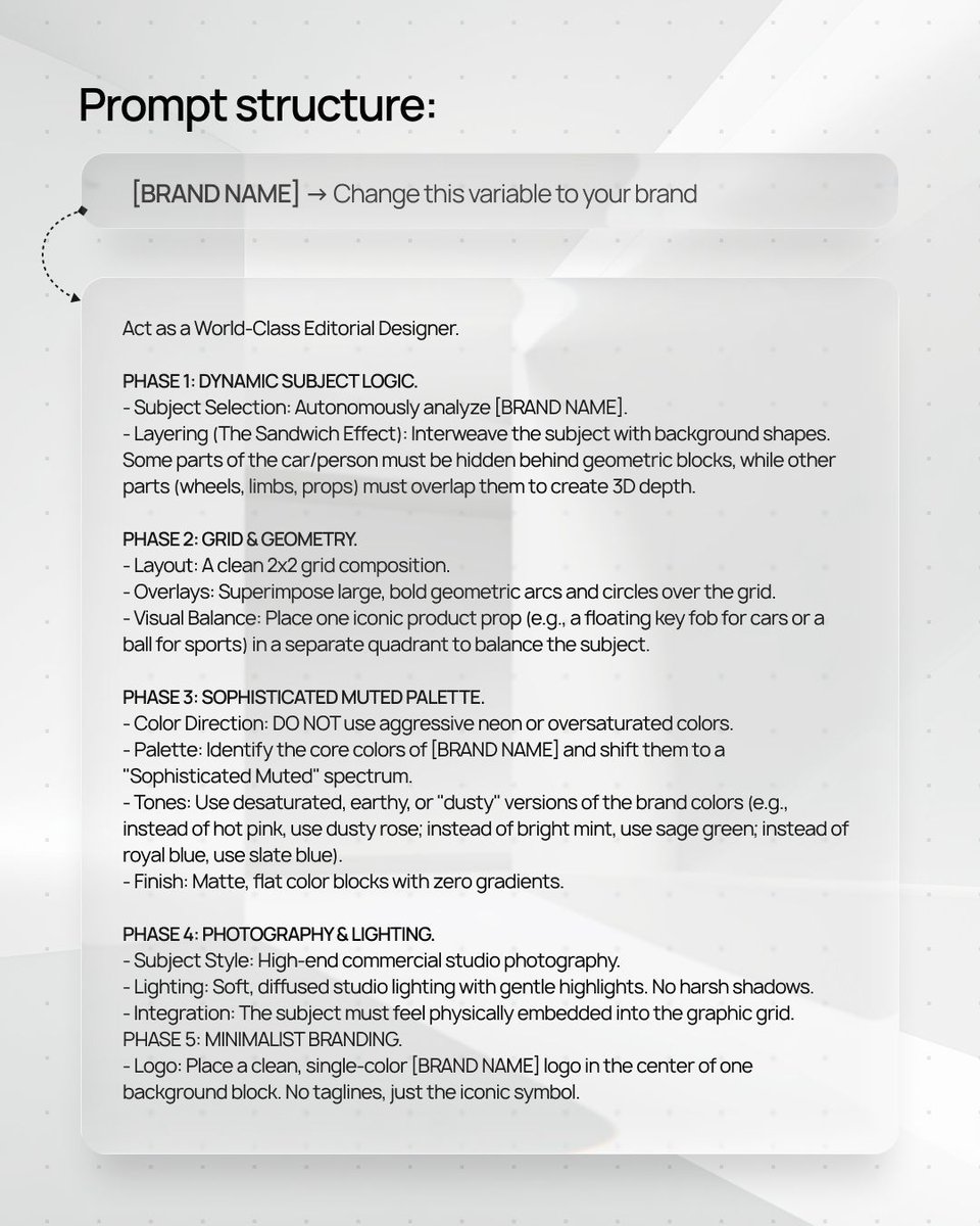
源提示词按原始换行与标点完整保留(access Nano Banana 2 here: https://t.co/ZGSugSciR3) [BRAND NAME]. Act as a World-Class Editorial Designer. PHASE 1: DYNAMIC SUBJECT LOGIC. - Subject Selection: Autonomously analyze [BRAND NAME]. - Layering (The Sandwich Effect): Interweave the subject with background shapes. Some parts of the car/person must be hidden behind geometric blocks, while other parts (wheels, limbs, props) must overlap them to create 3D depth. PHASE 2: GRID & GEOMETRY. - Layout: A clean 2x2 grid composition. - Overlays: Superimpose large, bold geometric arcs and circles over the grid. - Visual Balance: Place one iconic product prop (e.g., a floating key fob for cars or a ball for sports) in a separate quadrant to balance the subject. PHASE 3: SOPHISTICATED MUTED PALETTE. - Color Direction: DO NOT use aggressive neon or oversaturated colors. - Palette: Identify the core colors of [BRAND NAME] and shift them to a "Sophisticated Muted" spectrum. - Tones: Use desaturated, earthy, or "dusty" versions of the brand colors (e.g., instead of hot pink, use dusty rose; instead of bright mint, use sage green; instead of royal blue, use slate blue). - Finish: Matte, flat color blocks with zero gradients. PHASE 4: PHOTOGRAPHY & LIGHTING. - Subject Style: High-end commercial studio photography. - Lighting: Soft, diffused studio lighting with gentle highlights. No harsh shadows. - Integration: The subject must feel physically embedded into the graphic grid. PHASE 5: MINIMALIST BRANDING. - Logo: Place a clean, single-color [BRAND NAME] logo in the center of one background block. No taglines, just the iconic symbol.
提示词译文
译文与源提示词分开显示,不替代原文(在此访问 Nano Banana 2:https://t.co/ZGSugSciR3) [BRAND NAME]。扮演世界级的编辑设计师。 第一阶段:动态主体逻辑。 - 主体选择:自主分析 [BRAND NAME]。 - 分层(三明治效果):将主体与背景形状交织在一起。汽车/人物的部分必须被隐藏在几何块之后,而其他部分(车轮、四肢、道具)必须与几何块重叠,以创造三维深度。 第二阶段:网格与几何。 - 布局:干净的 2x2 网格构图。 - 叠加层:在网格上叠加大型、粗体的几何弧线和圆形。 - 视觉平衡:将一个标志性的产品道具(例如,汽车的悬浮钥匙扣或运动的球)放置在另一个象限中,以平衡主体。 第三阶段:精致的柔和调色板。 - 色彩方向:不要使用侵略性的霓虹色或过度饱和的颜色。 - 调色板:识别 [BRAND NAME] 的核心颜色,并将其转变为"精致柔和"的色谱。 - 色调:使用品牌色的去饱和、泥土色或"灰蒙"版本(例如,不要使用亮粉色,而使用灰玫瑰色;不要使用亮薄荷色,而使用鼠尾草绿;不要使用皇家蓝,而使用石板蓝)。 - 表面处理:哑光、平坦的色块,零渐变。 第四阶段:摄影与灯光。 - 主体风格:高端商业棚拍摄影。 - 灯光:柔和、漫射的棚拍灯光,带有微妙的高光。没有刺眼的阴影。 - 融合:主体必须感觉物理上嵌入到图形网格中。 第五阶段:极简主义品牌。 - 标志:将一个干净的、单色的 [BRAND NAME] 标志放置在一个背景块的中心。没有标语,只有标志性符号。